A visual comparison of different programming fonts. Carefully crafted sample text with blurry worst-case scenario code. Some not so humble opinions and a conclusion you're likely to disagree with.
Finding the Best Programming Font
It's four in the morning. I'm on my fourth cup of coffee. My source code is getting blurry. Where is that syntax error? Ah… there's a parenthesis that should have been closed. No wonder, it looked like the following curly bracket was the parenthesis. Perhaps if I had a different font where those two characters didn't look so similar…
And so the quest for the ideal programming font begins. Why must font previews be all about showcasing nice syntax highlighted and enlarged text? It seems like the only way to properly test a font is to try it out for several hours. I think it's about time we run some programming fonts through a visual stress test, to shake them out of their comfort zone.
(Skip to the examples) (Skip to the conclusion)
Finding candidates to test
Here are some of the resources I came across while browsing for candidates:
- Slant: What are the best programming fonts? - a very extensive list with user ratings
- Programmingfonts.org - lots of suggestions, and they also have a nice app where you can try out fonts live
- A well-written article by Matt Nerdrich providing an overview of default fonts in different IDEs on different operating systems and some font alternatives
At this point, my alternatives were well above 100. I needed to narrow down my alternatives, but first I needed to figure out what to look for.
Establishing test criteria
A good programming font needs:
- Monospace. While you can probably live with a variable-width font in dire situations, source code relies heavily on being able to scan/read your document vertically in columns. Most notably because of indentation. So if your i's and m's are different widths, you're gonna have a bad time. All of the fonts in this article are monospace.
- Distinctly looking characters. So you found a nice typewriter-esque typeface? Not so fast! There are some characters that are often mistaken for another, even when using popular programming fonts:
- Types of parentheses
{([])}which may be nested to make things more difficult - String identifiers (programming quotes)
"'`getting mixed up during concatenation - Commas and periods
.,:;being nearly the same size - Characters in the shape of a vertical bar
1Il|!i¡One time I received a password containing three such characters as a text message (shown in a regular non-programming font). Suffice to say, it did take some tries before I could login with correct credentials. - Similar digits and letters
0OØθB8&5S - Unusual whitespace characters such as non-breaking space (although this can usually be handled in your IDE by showing invisible characters)
- Legibility. You should not have to question what characters you are reading, and text strings and comments should be easy to read. If you deal with a lot of comments and text strings in your code, it's an advantage if all glyphs look somewhat familiar to you and don't require a learning curve. Some fonts feature ligatures, which to some extent may ease legibility, but on the other hand may lead to unfamiliar glyphs, such as != being replaced by ≠.
- Work at small sizes. In contrast to word processing which is mostly linear, programming involves a lot of non-linear reading (skipping between different sections of a document). Even though monitors keep getting higher resolutions, programmers constantly have to compromise between using a small font size to avoid too much scrolling, without causing too much eye strain from using small font sizes.
- All necessary characters. I work in Norway, which is a country that has a couple of non-English characters in its alphabet. But we're usually in luck, since those characters are all in the basic Latin character set. In other countries, the situation may be worse and a larger number of characters may appear in text strings that you come across in the code. Another typical example: Many of the older fonts also don't have the Euro currency symbol which perhaps didn't exist at the time the font was made.
- Weights and styles. Many IDEs use bold and italics as part of their syntax highlighting. If you use a font that comes with such weights and styles already built-in, the result is more optimized than the pseudo-bold or pseudo-italics done in your application. Especially if you're using a low resolution screen or bitmap fonts. Another argument for having multiple weights available is in order to reduce eye strain. Smaller font sizes are usually easier to read with heavier weights, while larger font sizes may need lighter weights so the result doesn't look so jarring. Also, when using inverse/night color schemes (light text on dark background), lighter weights must be used if you want to keep the same perceived stroke thickness of a font compared to regular dark text on light background.
- Visual appeal. Sure, it's nice to have a functional font that is nice to look at as well. But that is of lesser concern in the scope of this article.
Narrowing down alternatives using functional sample texts
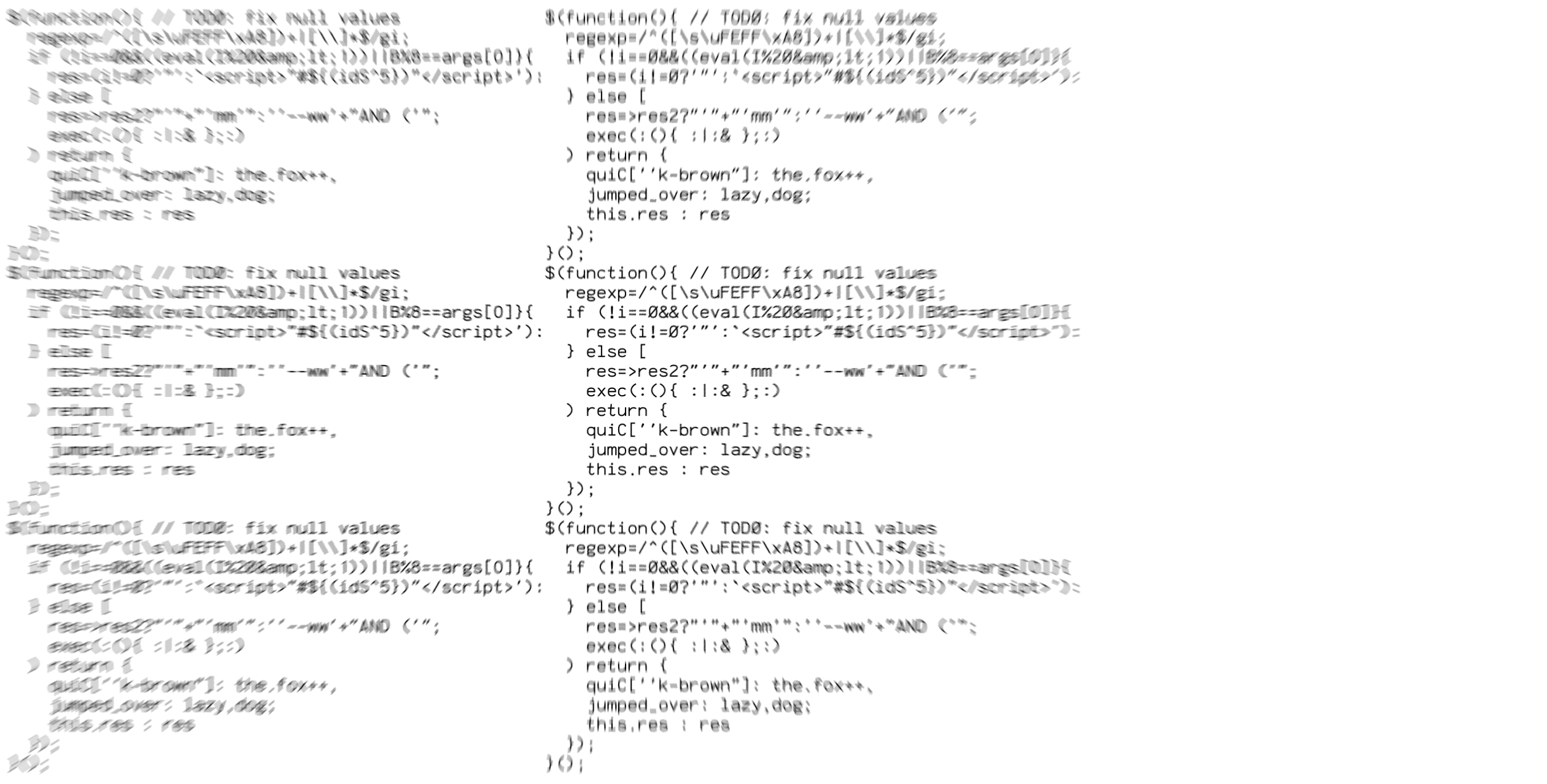
Too often when browsing for fonts, only a small subset of characters is shown in the preview. I decided to create my own sample text that positions similar characters next to each other and throws in a couple of extra unicode characters in there. Given the criteria I outlined above, I arrived at the following sample text:
<the quick="''""'+`${([1Il|!i¡/0OØøB8&%@~*#^>¤·→⇥¬
brown-fox:jumped.over,lazy–dogs;ÆÅ_æå–¿?27345S69¶§
‹«»›‘’“”…ACGQDEFHJKLMWNPRTUVXYZβßüéàœñçôřżłğðþ£¥€
½⅗²³⁰°©®™✓⌥⌘☞ αεωμγλΔΘθΩΠπплдияьъЫБЂбфФжцщш
ッシツお日大会漢字한글हकरᚼᛒᚱᚢᚾ⠚⠵⡻ينكقغشصאשמהחוז
It all started well, with grouping similar characters. But then I got a bit carried away: Latin accents, Polish, Turkish, Icelandic, Symbols, Greek, Cyrillic, cjk unified ideographs, Hebrew, Arabic, Futhark, even Devanagari and Braille. Sorry about the mess. Any curse words in there are purely coincidental.
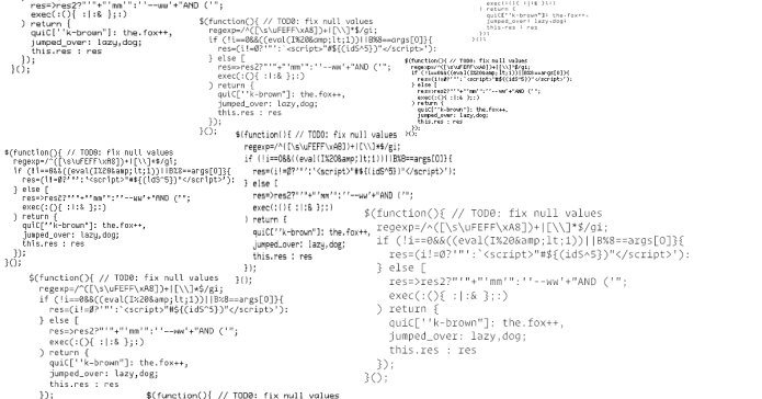
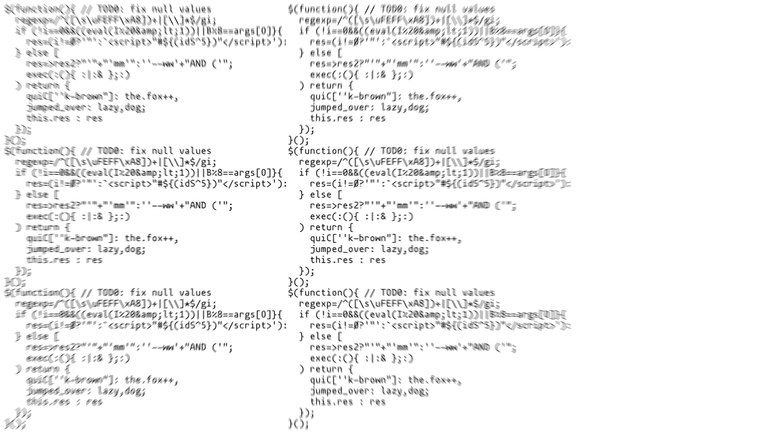
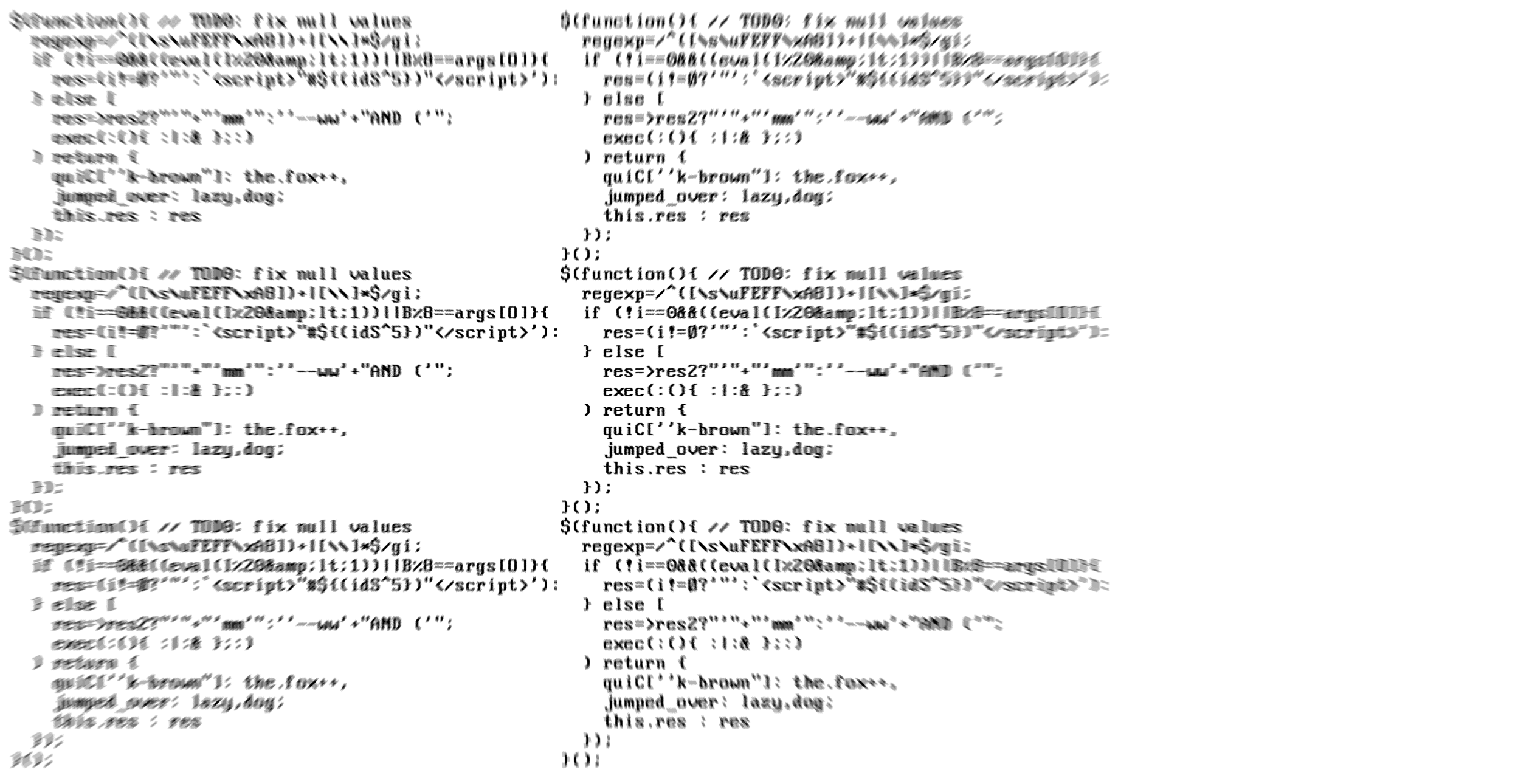
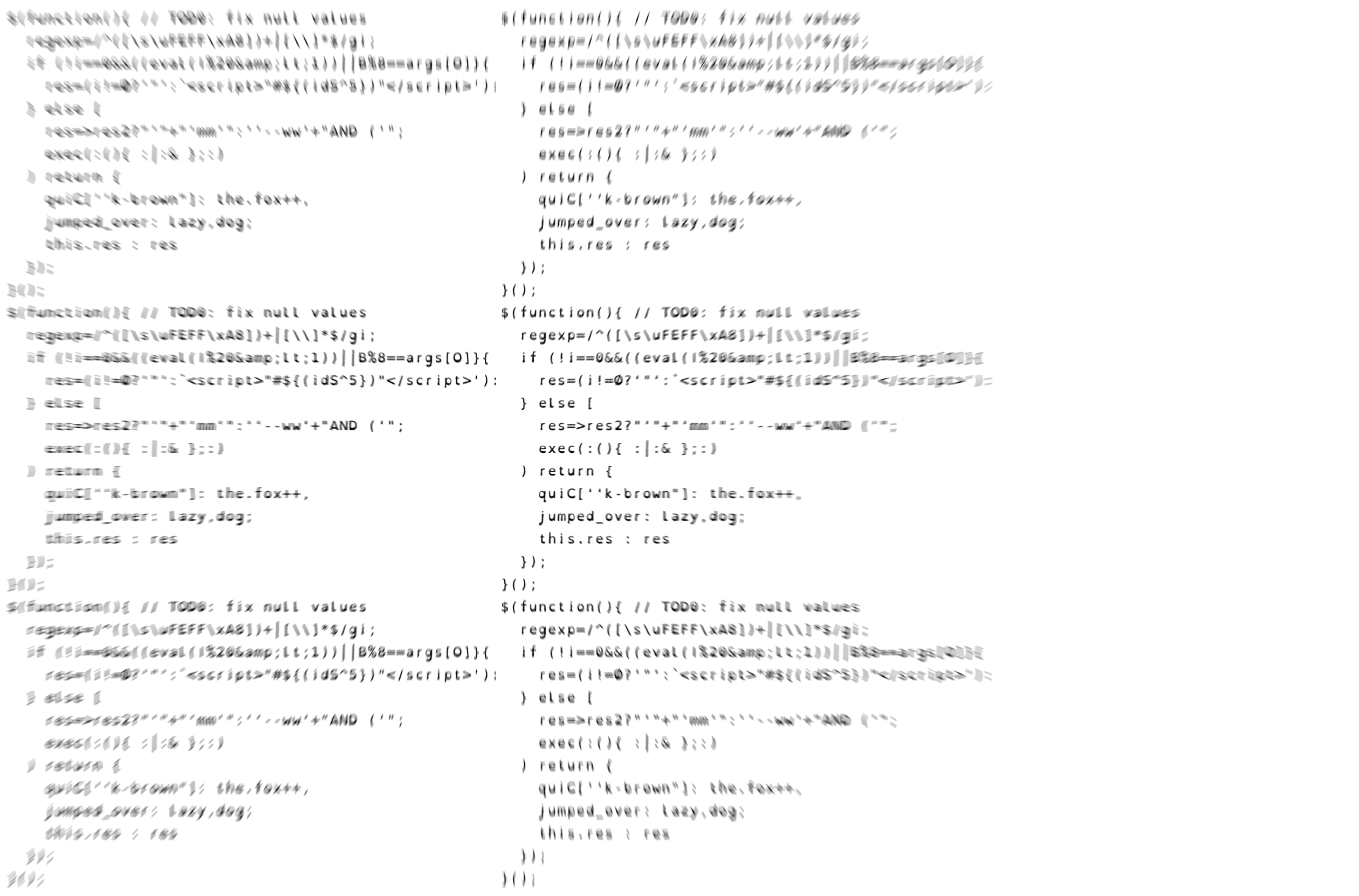
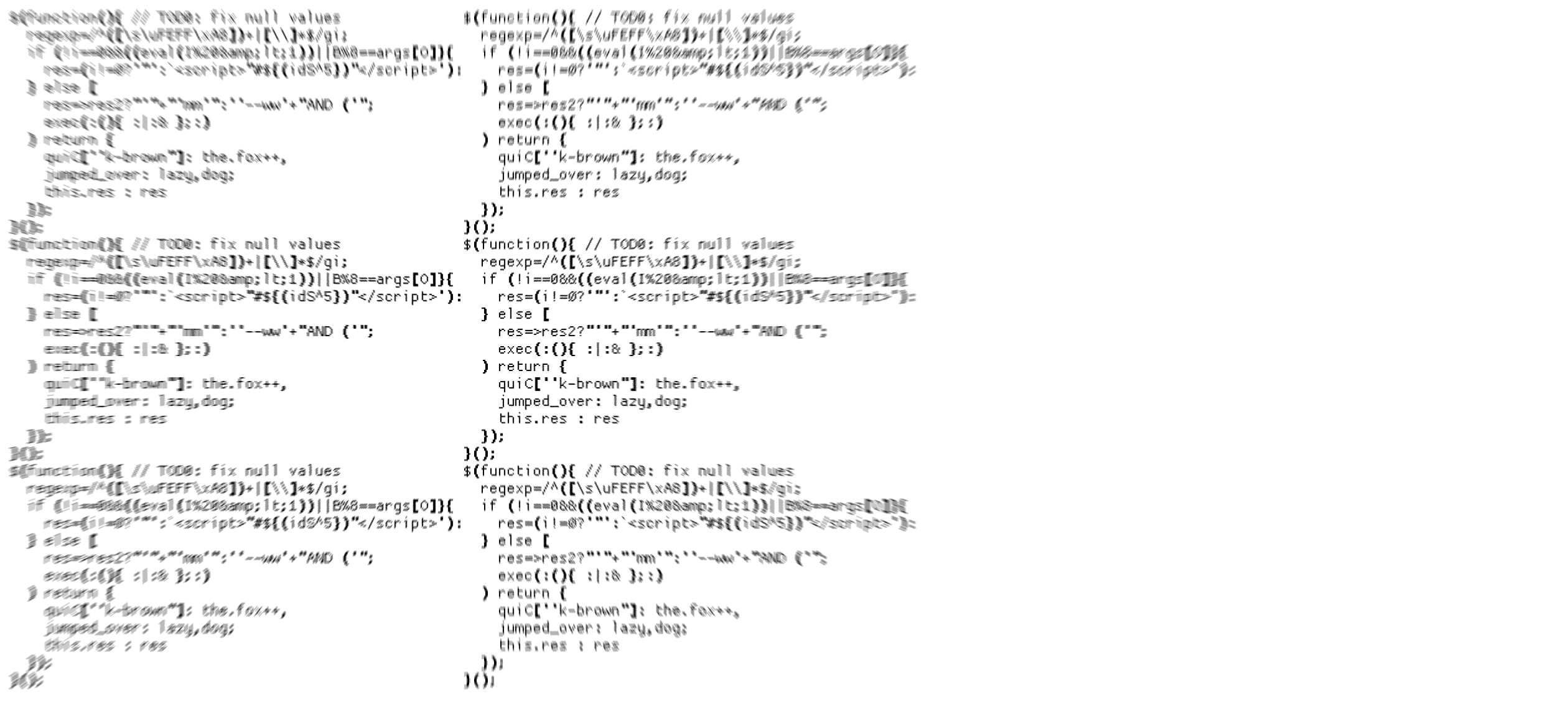
I also wanted some pseudo code as sample text in order to get a more practical preview of each font. But instead of just writing some hello world sample code, I wanted to make a worst-case scenario. Code that really puts some stress on my retinas. So I threw together some densely packed regular expressions, fork bombs, text concatenation, and syntax errors just for fun.
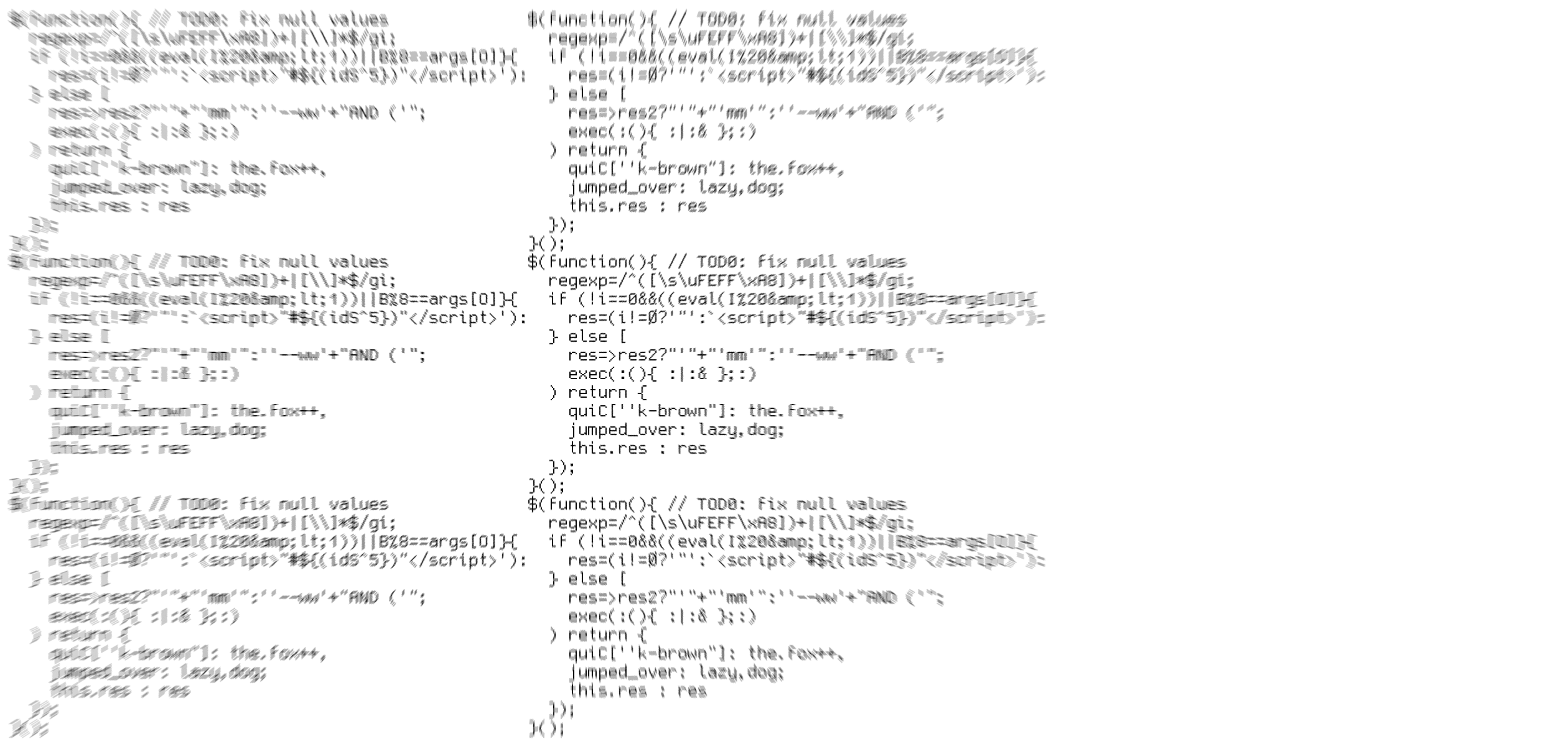
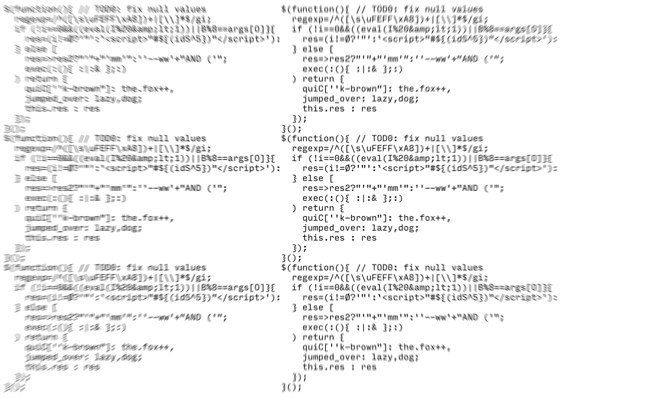
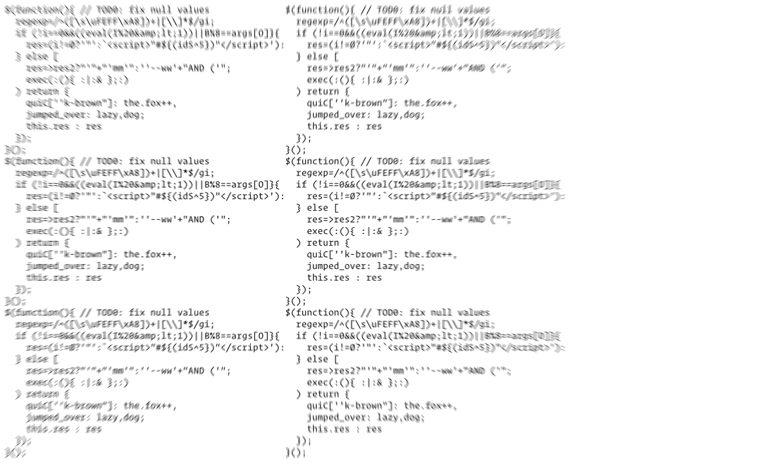
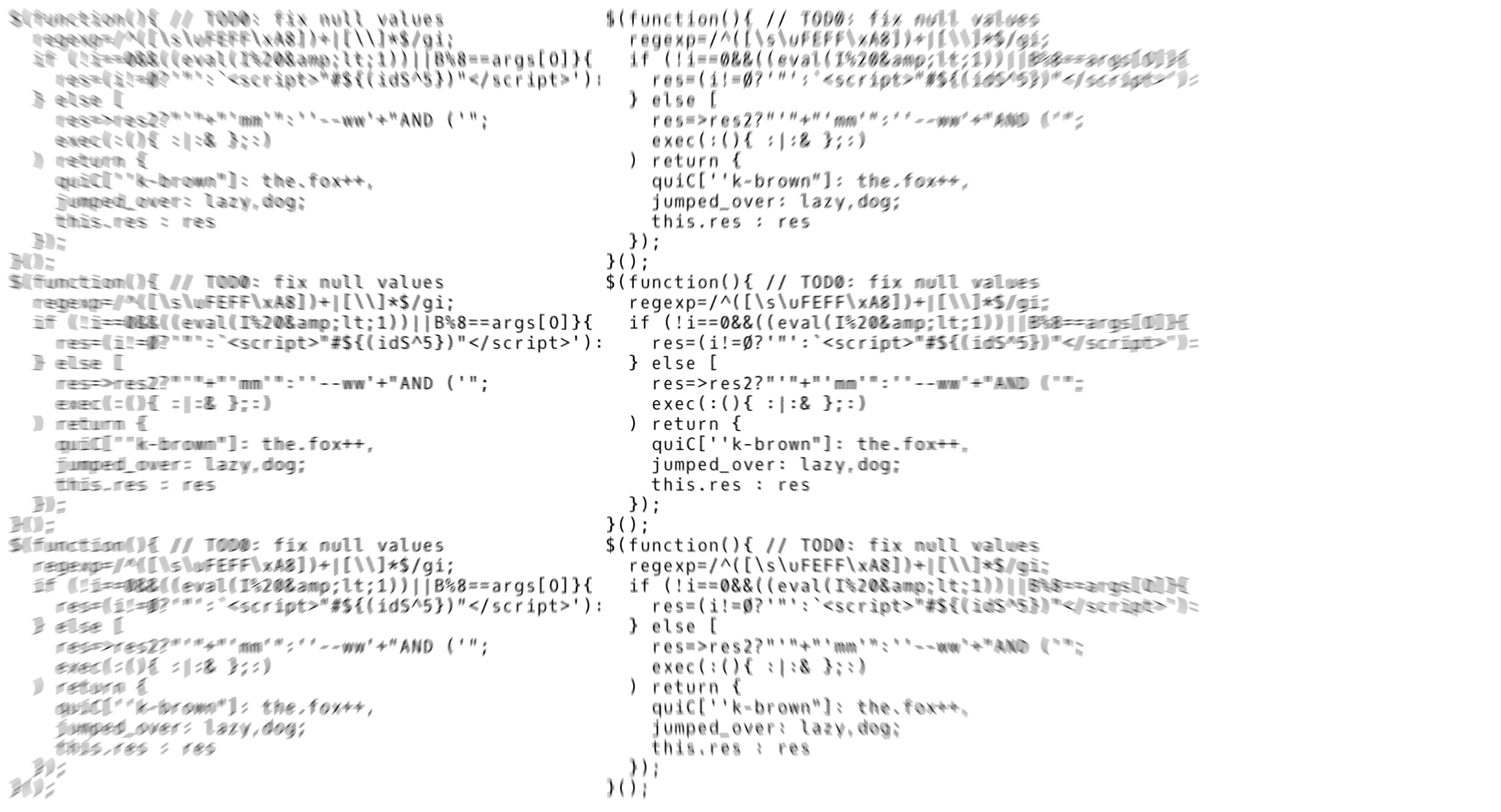
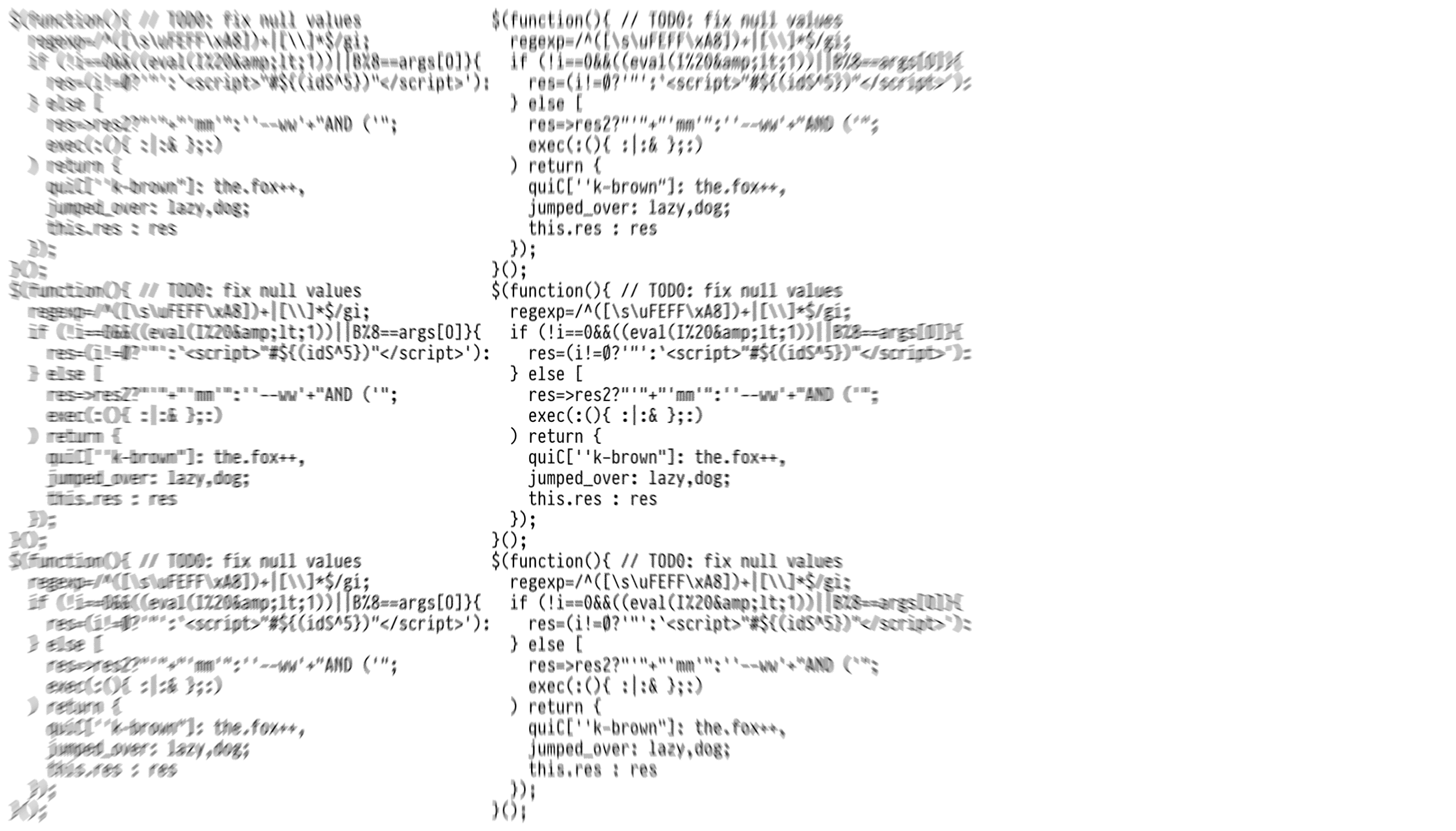
$(function(){ // TOD0: fix null values
regexp=/^([\s\uFEFF\xA8])+|[\\]*$/gi;
if (!i==0&&((eval(I%20&lt;1))||B%8==args[O]}{
res=(i!=Ø?'"':`<script>"#${(idS^5})"</script>'):
} else [
res=>res2?"'"+"'mm'":''--ww'+"AND ('";
exec(:(){ :|:& };:)
) return {
quiC[''k-brown"]: the.fox++,
jumped_over: lazy,dog;
this.res : res
});
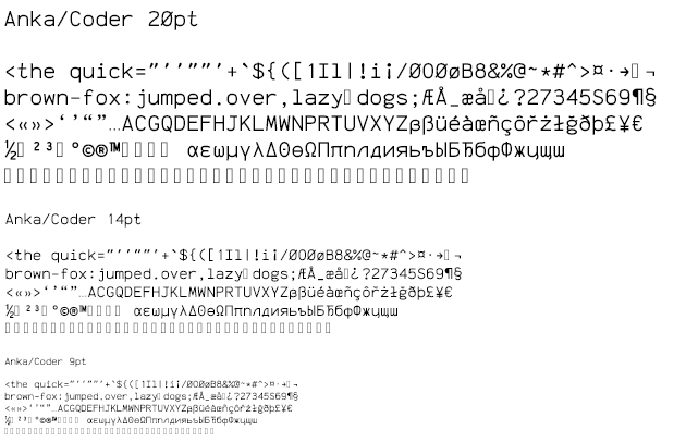
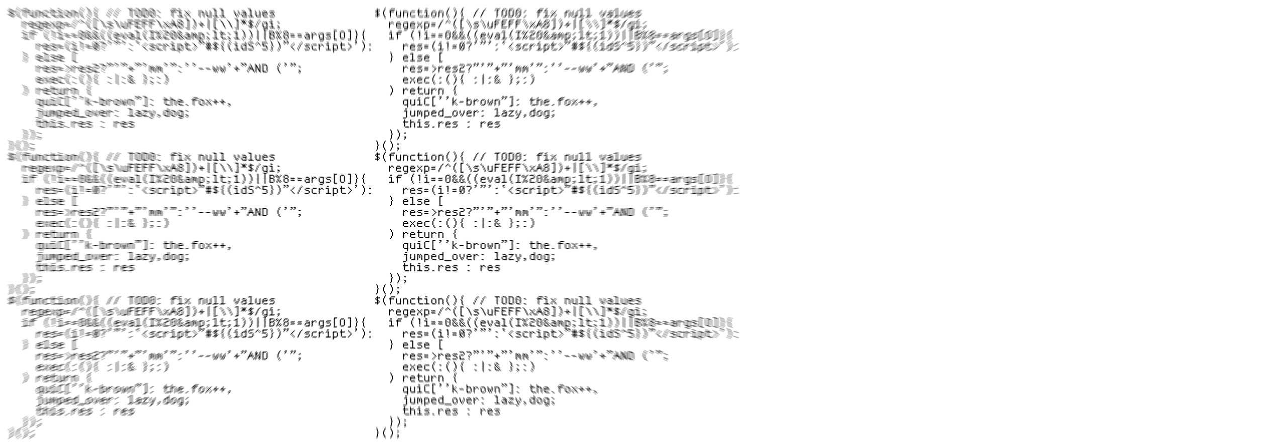
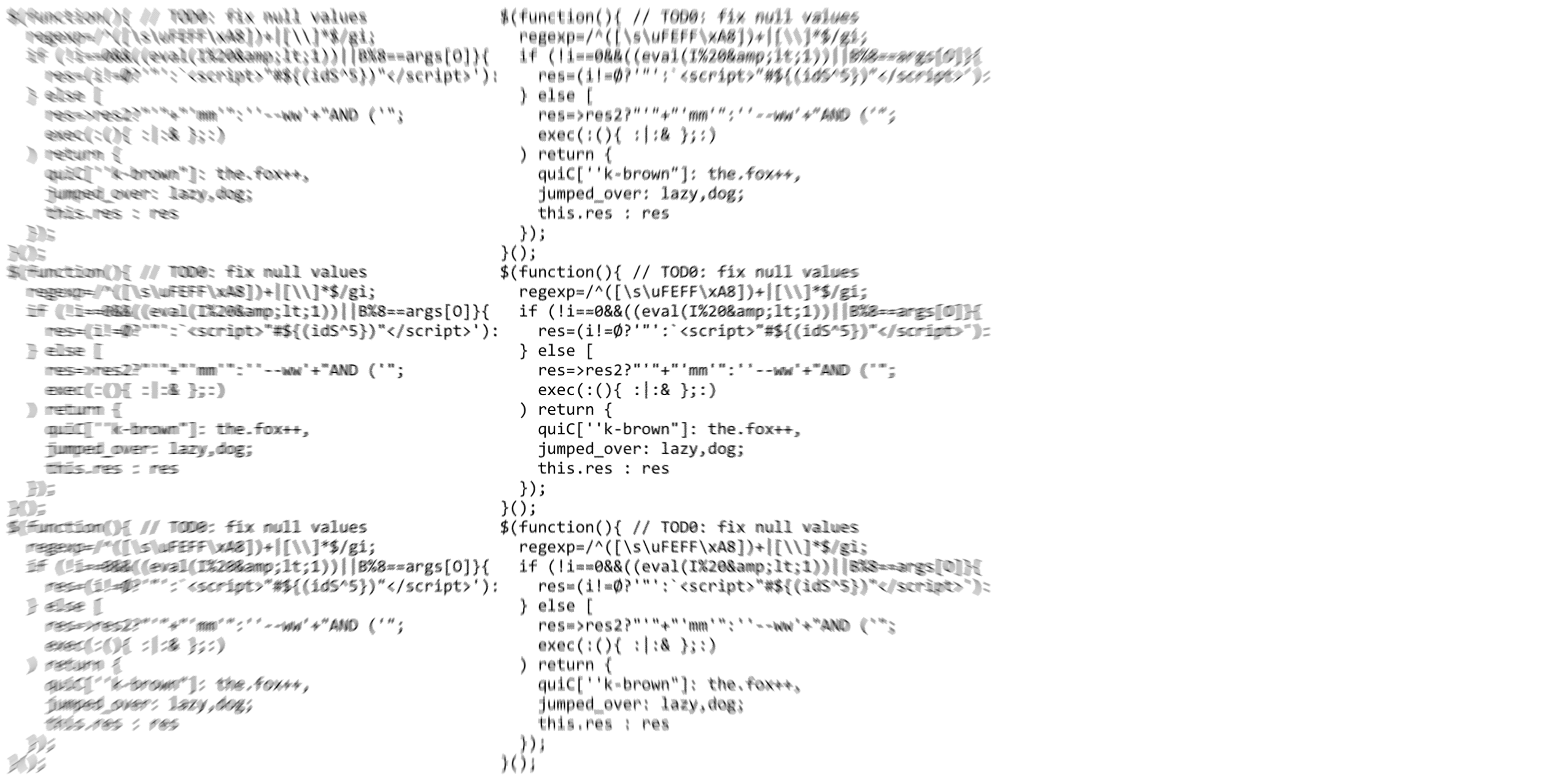
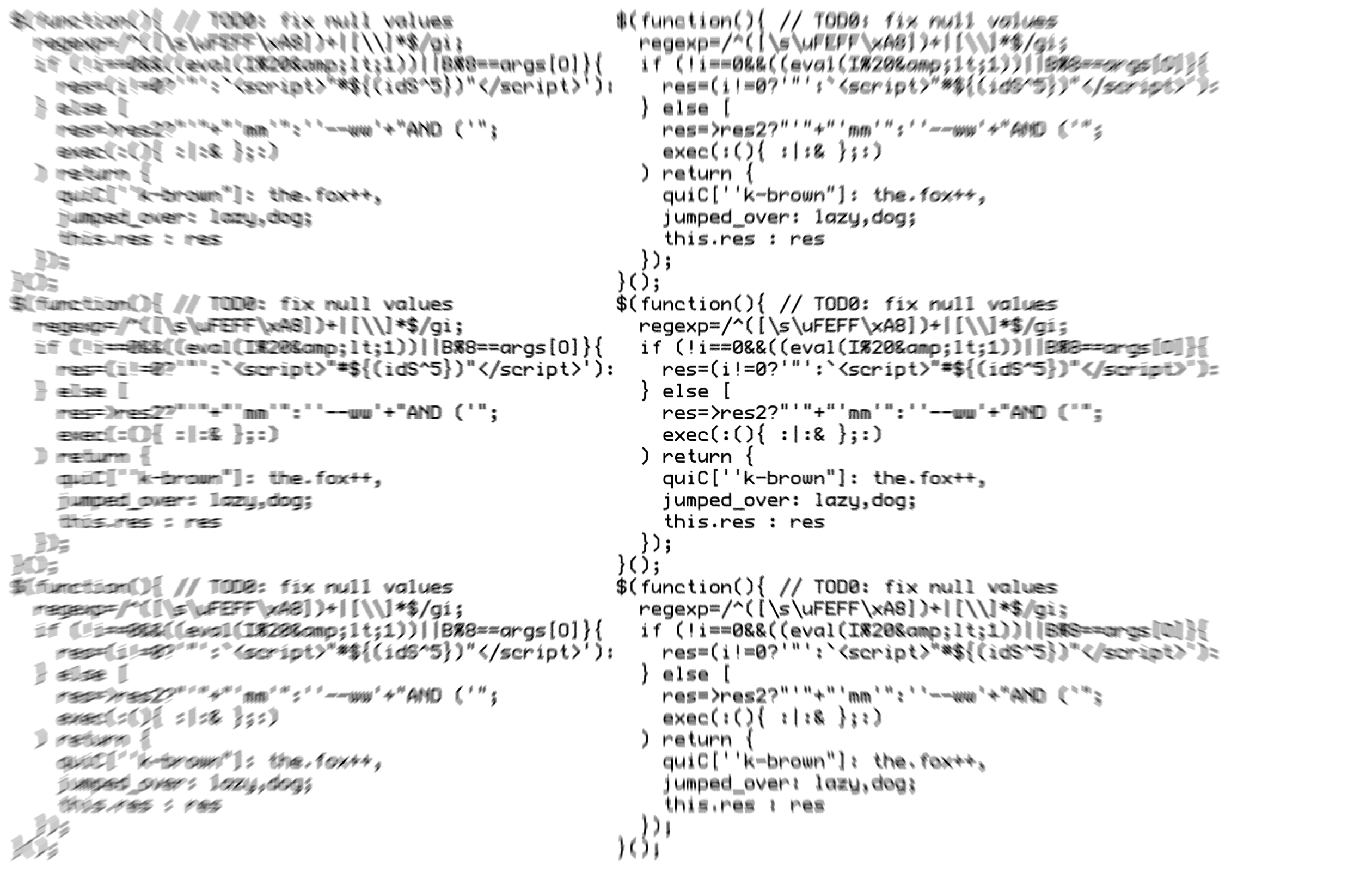
}();But still I wasn't satisfied. I've come across worse code snippets before. How could I simulate that sense of strained vision that can occur in the middle of a long coding session? Time to use Photoshop: Zoom blur. Instant four-in-the-morning-and-too-much-caffeine vision.
Analysis
Some quick notes about the images:
I made all images the same pixel width so that the text size remains consistent between each contender. I've assumed that most of you are reading this on a desktop devices, where the width of this text column is 630 pixels. The size samples are then at 1:1 scale, and the blurry code is at 1:2 scale. In other words, if you don't have a high-resolution display, open the images of the blurry code in a new tab/window. Or simply set your browser zoom to 200 percent.
Even though device pixel resolution displays are common these days, it's difficult to properly convey the exact feel of the subpixel rendering using screen shots. Therefore, I took screen shots at a traditional low resolution. If you want to know how a font looks renered on a high device pixel ratio, you'll have to try the font yourself.
All fonts are shown in regular weight and normal style. Extra weights and styles would have made this article far too long. Due to the blur effect, all the code examples appear to be of heavier weight than during regular use. All images were made directly in Photoshop in order to avoid system font character substitution (missing glyph protection). Font smoothing for outline fonts was set to Crisp, as that setting seemed to show the font hinting at its best.
The fonts are listed in alphabetical order below. Let the shoot-out begin.
Anka/Coder
https://fedoraproject.org/wiki/Anka_Coder_fonts
Since Anka/Coder is part of the Fedora Project, I was interested to see what it brought to the table. Time to try out my four-in-the-morning-vision filter:
Pros: Large character set (620 glyphs). Comes with the traditional quartet of bolds and italics. Available in three widths, where the narrowest one is also the narrowest I've seen in programming fonts.
Cons: Zero 0 and uppercase Ø look exactly the same. No em-dash and en-dash. Narrower widths compress the space between the quotes, making juxtaposed single and double quotes appear nearly identical.
CatV 6x12 9
https://fontlibrary.org/en/font/catv-6x12-9
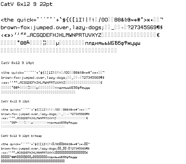
Pros: Cyrillic characters. Has a visible character for non-breaking space. Looks so 1337 that you'll need to use green or amber text color on black background.
Cons: Lacks non-English Latin characters (257 glyphs). Tiny quotes. While 1 and l look distinctly different, one of them may be interpreted as the other by accident unless you're already familiar with this font.
CG Mono
http://www.proggyfonts.net/cg-mono/
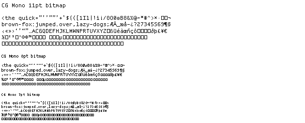
Pros: Works even at sizes below 9pt, which is impressive for a bitmap font.
Cons: Not pretty, and just with basic characters (228 glyphs)
Consolas
Part of the default Windows font bundle, Consolas can also be acquired when buying a copy of Microsoft Office.
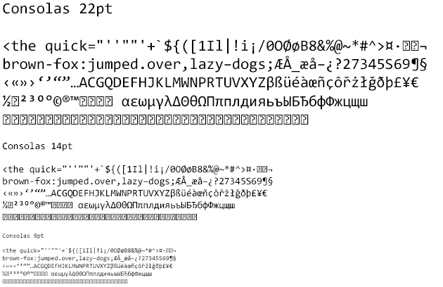
Pros: ClearType hinting. It doesn't show in the images above which were made on a Mac, but on Windows computers with low-resolution displays, Consolas really shines. Lots of characters including Greek and Cyrillic (709 glyphs).
Cons: Only regular weight and normal style. That's acceptable for bitmap fonts, but with outline fonts the competition is tougher.
DEC Terminal Modern
http://www.vtxemu.com/download.html
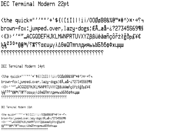
Pros: Amazing amount of characters (2218 glyphs), considering that this is a decorative font. And they are all very distinct from each other. With one exception…
Cons: The zero 0 is an oval, while the uppercase O is a rounded rectangle. Are you sure you'll remember that? Also more or less requires that you use a large font size or that you have a high-resolution display.
DejaVu Sans Mono
http://dejavu-fonts.org/wiki/Main_Page
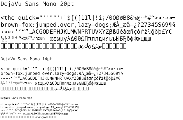
Pros: Lots and lots of characters (3377 glyphs). Traditional look.
Cons: Less distinct characters than Ubuntu Mono, especially when it comes to the single vs. double quotes and the parenthesis vs. curly brace.
Gohufont
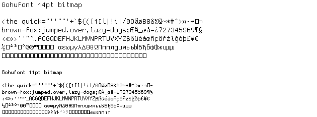
Pros: Large amount of characters (1698 glyphs in 11pt, 841 in 14pt). Not as many as UW ttyp0, but one advantage is that Gohufont doesn't need to be built from source. It works straight out of the box. Excellent character distinction. Easy to read.
Cons: Just two sizes available, although that's still twice as many than usual for bitmap fonts.
Hermit

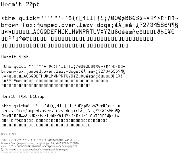
Pros: Distinct characters, three weights. Wide, cyber-futuristic look.
Cons: Limited amount of characters (264 glyphs), such as lacking curly single quotes.
Input Mono
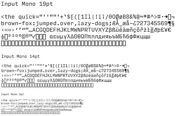
Pros: Lots of weights. Lots of widths. Italics. Large character set. The font works great on high-resolution devices. Lots of characters (922 glyphs) including Greek and Cyrillic. Input is free – for private use.
Cons: While all weights also have italics, they're just obliques (slanted, not curved). Its closest competitor Operator Mono has more beautiful true italics (but isn't free). Single and double quotes have too similar grouping, especially on narrower widths. I'd prefer if the lowercase l didn't have a serif in the bottom left corner, to make it more distinct from the one 1 and the capital I.
Lucida Mono EF
I wanted to include Monaco in this test, but since that font is only available on the Mac, it would be a bit unfair. But thankfully, Elsner+Flake have made this version (and it needs to be the EF version) which has the same prominent features as Monaco, only with slightly smaller character set and some glyph differences such as square periods/commas and dotted zero.

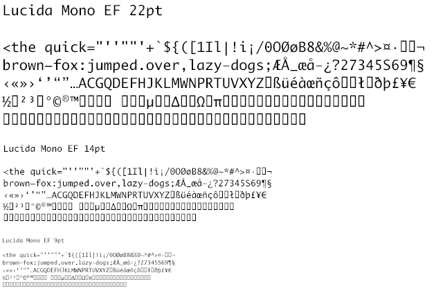
Pros: The font has a neutral/traditional look which makes it very legible and without any learning curve. All characters have been made very distinct without sacrificing legibility. I especially like the difference between single and double quotes which is visible even at tiny sizes, as well as the well-defined shape difference between {([])} which similar-looking fonts such as Consolas etc. struggle a bit more with.
Cons: Only one weight, limited amount of characters (247 glyphs) compared to similar traditional-looking programming fonts. Not the greatest difference between period and comma, although adequate.
Luculent
http://eastfarthing.com/luculent/

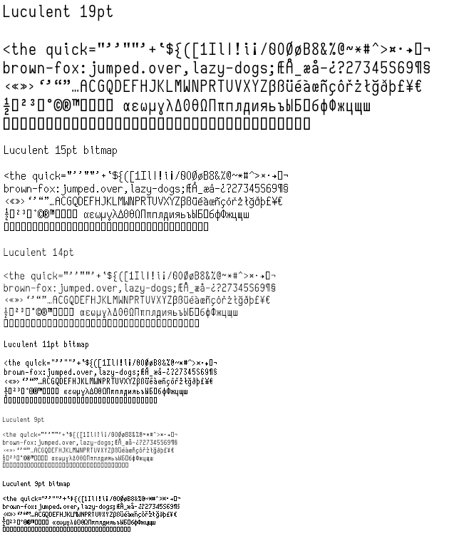
Pros: Simply the best hinting I've seen. If it looks as nice non-antialiased on Windows as it does on my Mac, you can knock Consolas off the throne as far as Windows hinting is concerned. And if for some reason the hinting doesn't work for you, you may download font files that have been optimized for specific sizes. Exceptional distinction between all characters (watch and learn, font developers!) except straight single quote (apostrophe) ' and curly single quote ‘. Good character set size (649 glyphs), bold and real italics. Among the narrowest fonts in this test, which is practical when viewing code side-by-side such as in diff tools.
Cons: Zero 0 has a backwards slash, which made it look a bit like an 8 until I got used to it. Single quote appears a bit too far to the left, creating a half-space that sometimes looks more like a full space. The narrow character width can make Luculent look a bit heavy/dense, although this is not a problem if line height is increased and antialiasing is turned off.
M+ 1mn
http://mplus-fonts.osdn.jp/design.html#mplus_mn1
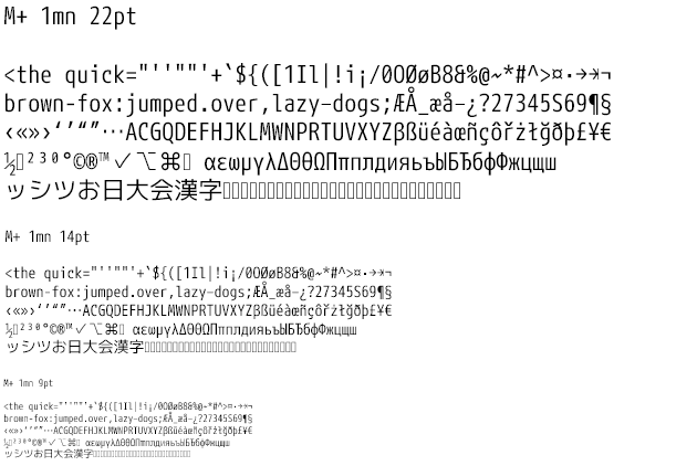
Pros: Largest character set of any programming font I've come across (7831), and the only programming font I've found that has Chinese and Japanese characters. Post-millennial look similar to Ubuntu. Available in five weights.
Cons: Despite having Chinese and Japanese characters, Korean seems to be missing. Arabic and Hebrew characters are also missing, which would otherwise have made this a perfect multilingual font. Not the best hinting in the world, but the five weights make up for that a bit, at least on high-resolution displays. Average degree of character distinction, parenthesis and curly brace can get too similar when out of focus.
mononoki
https://madmalik.github.io/mononoki/
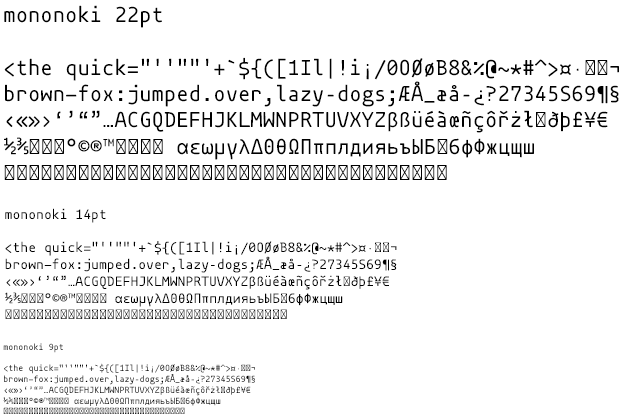
Pros: Mononoki looks so sweet and cute that I'd like to give it a hug, due to its casual and rounded look. A bit like an exaggerated Ubuntu Mono, in a good way. Excellent overall character distinction if we overlook the similar quotes.
Cons: The single and double quotes are nearly rectangular and of equal size which could potentially cause confusion when juxtaposed.
Nouveau IBM
http://www.dafont.com/nouveau-ibm.font
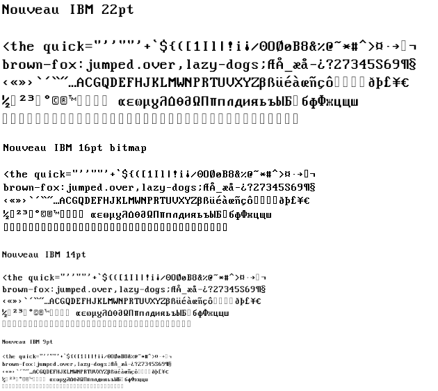
Pros: Many distinct characters (449 glyphs). Comes in two widths. High nostalgia factor from the IBM PC and Windows command console. I feel like I have to type on an old school clickety-click keyboard to do this font justice.
Cons: Uppercase I and lowercase l are too similar. That could be a deal-breaker for most of us. There's also just one weight that is quite heavy.
OCR A Std
This is the version of OCR A Std made by Adobe that is bundled with their Creative Suite.

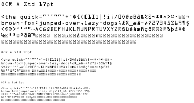
Pros: Extreme distinctness between characters. Can tolerate very small sizes (8pt on low-resolution displays, 5pt on high-resolution displays). This in combination with its short height makes it very well suited for situations when you need to see lots of lines of text at the same time, for instance when reading server logs.
Cons: Machines may like OCR A, but humans will probably find it to be a bit too much form over function, as it is not very legible. The square brackets seem to grab unusually much attention. It's also a bit confusing that the 0 and the O are distinguished by their geometric shape, especially considering that the lowercase o is a rounded rectangle, but the uppercase O is not a rectangle but a diamond, while the rectangle instead is assigned to the zero 0.
OpenDyslexic Mono
People who suffer from dyslexia often confuse characters that are mirrored copies of each other, such as b/d, p/q, n/u, m/w, d/q, p/b, f/t and so forth. This font adds a bit of depth perspective shadowing in order to alleviate some of these problems. I'm not dyslexic, so I can't tell if it makes any difference.
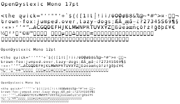
Pros: I know many programmers who have some degree of dyslexia, so kudos to the font designers for filling a need that I know is prevalent. Relatively large amount of characters (531 glyphs), although missing Greek and Cyrillic.
Cons: At smaller sizes, the distinction between parenthesis-like and vertical bar-like characters suffers quite a bit. The comma could also have been more pronounced. But at larger sizes this should work well. Just one weight.
Operator Mono
http://www.typography.com/fonts/operator/overview/
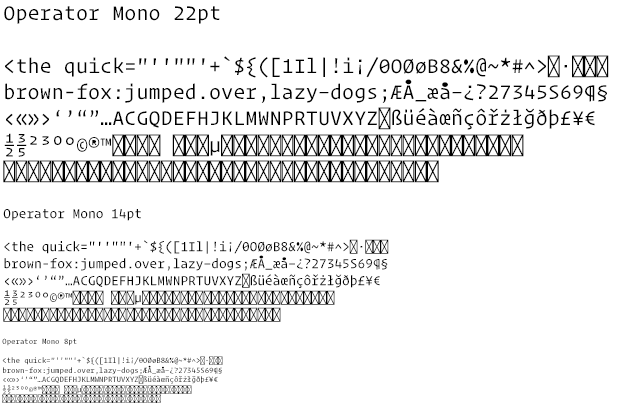
Pros: While not free, Hoefler & Co. prove with their Operator Mono that get what you pay for. Lots of weights and simply beautiful italics. Excellent character distinction. Works great on high-resolution displays even down to sizes below 9pt. Did I mention that the italics were beautiful?
Cons: By far the most expensive font in this shoot-out. Character count is adequate (434 glyphs), but I wish there were more Greek characters, or maybe that's just because Operator Mono visually reminds me of the caps from Adobe Lithos? Also, Input Mono may not be as stylish as this, but has both Greek and Cyrillic characters.
Oxygen Mono
https://fontinfo.opensuse.org/families/OxygenMono.html
Interface font made as part of the KDE Project.
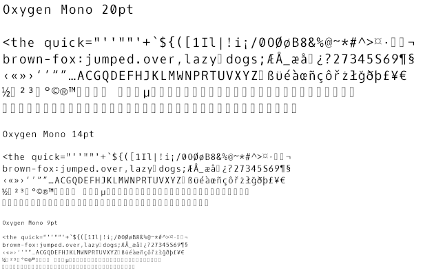
Pros: Optimized for FreeType rendering on Linux (sadly not shown in these images which were made on a Mac). Excellent character distinction, better than Ubuntu which is its closest rival on Linux.
Cons: Small character set (285 glyps) lacking em-dash and en-dash. Only one weight.
PragmataPro Mono
http://www.fsd.it/shop/fonts/pragmatapro/
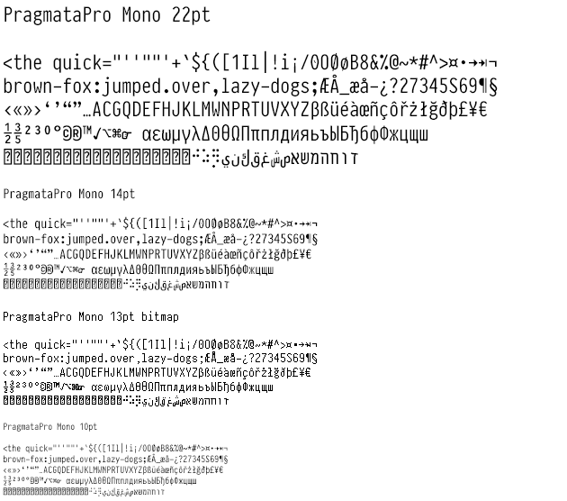
Pros: Gigantic character set (6561 glyphs) that includes both Hebrew, Arabic, lots of symbols and even Braille. Good character distinction.
Cons: Not free. Rectangular single and double quotes with the same size and such similar grouping can be problematic.
ProFont
http://tobiasjung.name/profont/
ProFont IIx is an updated version that includes the Euro symbol.
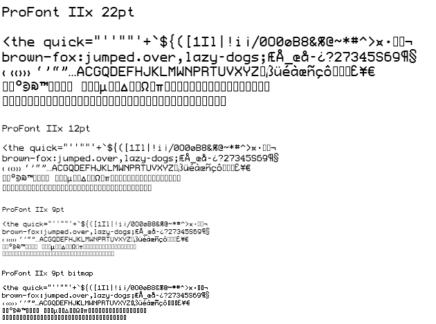
Pros: Works well in sizes 9 and 12, where it can even be used non-antialiased. To work well in other sizes you should be using a high-resolution display. Looks very cyber-futuristic. I like how the curly brace is of a different height than the parenthesis and square bracket.
Cons: 0 and Ø look the same. Not many characters (263 glyphs).
Proggy Clean Bold Punctuation
http://www.proggyfonts.net/proggy-clean-szbp/
Pros: The distinctness and legibility that has made the Proggy fonts popular for decades.
Cons: Limited number of characters (257 glyphs), bold quotes make them hard to read when next to each other, and bold curly brace is difficult to distinguish. Also, most modern IDEs can do syntax highlighting that makes built-in boldification in the font completely unnecessary.
Ubuntu Mono
Default monospace font in Ubuntu, made by Dalton Maag.
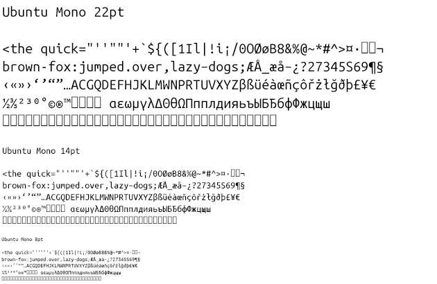
Pros: Very large character set (1296 glyps) with all necessary left-to-right scripts. Good hinting that makes the font legible even at tiny sizes such as 7-8pt where eye sight becomes a bigger problem. Good character distinction without sacrificing legibility. Post-millennial visual style. Available in the traditional quartet of bolds and italics.
Cons: Not really any cons. Unless you want to be a disgruntled fanboy and dislike everything that reminds you of Ubuntu? DejaVu Sans Mono has more characters such as Arabic, but doesn't score as well on character distinction.
UW ttyp0
https://people.mpi-inf.mpg.de/~uwe/misc/uw-ttyp0/

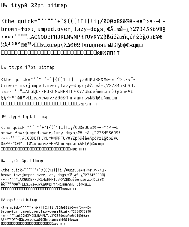
Pros: The feature list of UW ttyp0 is really impressive, especially given that it is a bitmap font. Huge character set (3078 glyphs), including Greek, Cyrillic and even Hebrew. Also available in bold, and even italics in sizes 15-18pt. Lots of configuration options for different glyphs, including types of quotes and the option to have non-breaking space be shown as a toppled square bracket. Excellent character distinction.
Cons: Must be built from source. That's not a problem on Linux where it even auto compresses and installs the font for you, but to use the font on Windows or Mac you'll then need to convert the compiled BDF files using FontForge or similar tools. Reminds me a bit too much of when I wanted to try out Gentoo Linux and just gave up after compiling packages for three days.
Conclusion
None of the contestants in this shoot-out received a perfect score in every category. You're going to have to decide what is most important to you:
- Generally great: Ubuntu Mono
- Elegance and italics: Operator Mono
- Rounded look: mononoki
- Cyberpunk look: DEC Terminal Modern
- Traditional look (Mac): Monaco
- Traditional look (Windows): Consolas
- Traditional look (Linux): DejaVu Sans Mono
- Choice of weights, styles and widths: Input Mono
- Number of characters: Pragmata Pro (or M+ 1mn if you need CJK unified glyphs)
- Antialiasing agnostic: Luculent
- Narrow width: Luculent
- Low height: OCR A Std
- Bitmap ease of use: Gohufont
- Bitmap configurability: UW ttyp0
- Dyslexia: OpenDyslexic Mono
Which font did I settle for? Well, despite all my efforts to decide on a programming font based on functional criteria, my final choice was highly based on gut feel and ignoring some of the objective data. I'm now using mononoki simply because it feels right to me. Despite the fact that it lacks many characters and the single and double quotes appear too similar. Then in a few months, maybe my font choice will change once again? Time will tell.
Feel free to share your opinions in a comment below!