Annoyed by that pale yellow background-color (and black text) that Google Chrome will force on any input field that it autocompletes? Well, we have the CSS-hacks for overcoming all the different design-scenarios you might have, be it controlling background colors, gradients, images, or even icons!
The ultimate list of hacks for Chrome’s forced yellow background on autocompleted inputs
This article will in detail explain how (updated for 2017/2018) you can overcome this pale yellow background, that Chrome forces on you, for any type of design - including inputs with partially transparent background color, background images, and icons!
“Even though I walk through the valley of autocompleted forms, I will fear no yellow, for this blog is with me; your CSS and hacks, they comfort me.”
Background
Late 2014 I first struggle with a pretty sign-form for a client, that lead me to a CSS hack that could trick Chrome and overwrite that yellow background. In February of 2016 I wrote about that CSS hack here - how to overcome Chrome’s standard behaviour of adding a forced pale yellow background color to all auto completed form items. Check out the full article if you want some history in the subject.
The enforced code
So, Chrome forces this ugly yellow color (#faffbd) on all auto completed input fields. With its hints of green it sits there, staring you blind. And it can’t be overwritten with normal CSS, not even with the old but almighty IE-slaying sword that was !important. Misleading to say the least.
Here’s the CSS Chrome applies:
background-color: rgb(250, 255, 189); // #faffbd
background-image: none;
color: rgb(0, 0, 0);
And now?
Chrome developers have know about this for ages. This is now a 7+ year old issue the Chrome developers track. It’s not moving, at all! Even Chrome version 62 (November 2017) has this problem. And people keep on struggeling, and cursing, about yellow fields over at Stackoverflow.
But, thankfully, we have a lot of people out there that can outsmart Chrome. And over the course of these last two years I’ve had many questions, and suggestions, over at the original article. Together these new hacks aggregated into this article after I decided to revisit this subject.
In the original article we only covered how we could hack opaque background colors. This time around we’ll learn how to make your input fields fully transparent, semi transparent, add gradient background colors, add background images, or even icons. We’ve finally nailed all the scenarios!
The questions and feedback
First off, some feedback and questions from @MrColes and many others. They're about the other types of form elements that are not using the input-tag, like radio buttons, drop down selection lists, textareas, and others. After checking that out I cannot see that <textarea>, <select> - or any other element for that matter - gets that yellow background color. Only <input> elements (no matter the type). So I guess that case is now closed.
I also got some questions about password fields, but the same techniques apply here.
Some other comments cited issues with color bleeding over the edges (@thiagolagden), and flickering colors when using this hack. I have, however, not been able to reproduce any of these problems in Chrome 59 to 62, and concluded them to be solved by Chrome, or the result of conflicting CSS. Please comment if I need to revisit any of these cases.
The foundation
With that over and done with, let’s go through all the cool new tricks we can use to combat that ugly yellow background color in Chrome - #faffbd.
Base HTML being used in all examples (if nothing else mentioned):
<div class="input-group">
    <label for="inputName">Label</label>
    <input name="inputName" class="inputName" id="inputName" type="text" />
</div>
At the very end of the article you can run a little demo, inspect the source and try all the examples. Each hack is grouped under its own heading. Let's start!
Overwrite Chrome’s forced yellow background color (the original)
This is the original, added here for reference, read my original article for details.
To set any background color (opaque) for your input fields, even when they’re autocompleted by Chrome, just apply this CSS to those input fields.
.inputBgOpaque:-webkit-autofill {
    -webkit-box-shadow: 0 0 0 100px white inset;
}
The vendor prefixed selector only applies to Chrome and Webkit browsers, and the vendor prefixed box-shadow property paints a huge inner shadow without any blur, thus creating a new opaque background color. The users can’t see the difference. Clever! Just change white in that code snippet to any color you like, be it hexadecimal, rgb(), hsl() or any other color format.
Do you want transparent or partially transparent background colors, background images, or icons? Keep reading!
How to overwrite Chrome’s forced text color
This hack is sent in by @johannestassilogruber. It's helpful for when you cannot use the forced black text color of autocompleted input field’s text. Using a color: white !important; wont work, as with the other forced values.
The hack uses a CSS spec for creating text stroke effects that is not yet finalised by W3C. But it works in Chrome (and all other browsers, except IE), and that is all we need since only Chrome paints autocompleted fields in yellow. With it you can add stroke and fill color (even transparent color) to text. It’s dated all the way back to 2006. We can use this to paint over the forced color: rgb(0, 0, 0); that Chrome have given the field.
.inputTextColor:-webkit-autofill {
    -webkit-text-fill-color: #f90;
}
A combination of the :-webkit-autofill and the -webkit-text-fill-color puts you back in control over the text color of your fields again. You wouldn’t want a black background color with black text now would you? Us versus Chrome: 2 - 0!
Set any background color, only on :focus :hover (and other states)
If you only need to overwrite the background and text color when hovering the field, or when you give it focus, then this is how you do that:
.inputHoverFocus:-webkit-autofill:hover,
.inputHoverFocus:-webkit-autofill:focus {
    -webkit-box-shadow: 0 0 0 100px white inset;
    -webkit-text-fill-color: #f90;
}
You simple add state to your state (yodawg)! Add your :hover, :focus, :active, or other state at the end of the existing selector with the :-webkit-autofill state. The other CSS is the same for overwriting color of background and/or text.
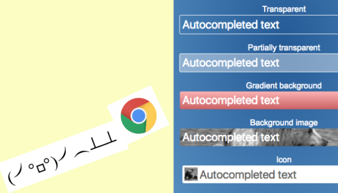
Fully transparent background for autocompleted fields
This one question popped up quite frequently in the disqus comments of the original article. How do you set a fully transparent background color on a field that Chrome autocompletes? The solution also arrived in the comments, and it’s as brilliant and clever as simple, and it can be used for some other scenarios as well. Big thanks to Kevin Gonzales for handing me this!
First, set your initial design CSS for the input just like normal. This will work in all browsers, except in autocompleted Chrome.
.inputTransparent {
    border: 1px solid black;
    background-color: transparent;
}
Then, add this little hack making Chrome create a transition delayed by X seconds. This means a transition from your initial CSS to Chrome’s override CSS is delayed. A user will not see Chrome’s override unless they stay on this form for a very long time. Make sure you add the delay on the normal state and the three other states listed below (hover, focus, and active), or else the colors might flicker when the state is changed.
.inputTransparent:-webkit-autofill,
.inputTransparent:-webkit-autofill:hover,
.inputTransparent:-webkit-autofill:focus,
.inputTransparent:-webkit-autofill:active {
    -webkit-transition-delay: 99999s;
}
And since the transition-delay is vendor prefixed, only Webkit browsers will bother with it. Your input field is now fully transparent even though it is autocompleted by Chrome. This way is also much better (and less demanding on the client) than using a very long transition-duration (which will be animating constantly until the timer duration is over even if the color change is not visible).
Partially transparent background color (using the alpha parameter)
The same hack Kevin Gonzales handed me also works for background colors with the alpha parameter present - partial transparency. Just add your color in any format to your input field as you’d normally do:
.inputPartial {
    background-color: hsla(1, 100%, 100%, 0.4);
}
Then apply the -webkit-transition-delay hack:
.inputPartial:-webkit-autofill,
.inputPartial:-webkit-autofill:hover,
.inputPartial:-webkit-autofill:focus,
.inputPartial:-webkit-autofill:active {
    -webkit-transition-delay: 99999s;
}
If you rushed your thoughts to the conclusion “why doesn’t he just use opacity:0.5; instead?” I would like to stop you there and remind you that a property like opacity affects everything about the field, even text color and borders. So it can’t be used (unless that is what you really need).
Add gradient backgrounds on auto completed inputs
When it comes to background gradients (and in later examples: images) we must resort to a rather blunt and primitive weapon: additional html elements. Our base HTML also needs a tiny extension. A class called group-gradient needs to be added to the wrapping element. Then we wrap our input-field in a new element, a "snug wrapper". The snug wrapper’s purpose is to be the actual "carrier" of the gradient. Sadly, this is the only way I’ve found, so far.
<div class="input-group group-gradient">
    <label for="inputGradient">Gradient background</label>
    <div class="input-wrapper-snug">
     <input name="inputGradient" class="inputGradient" id="inputGradient" type="text" />
    </div>
 </div>
The updated base HTML looks like so, code additions in bold.
With this we can now apply the gradient to the wrapper, and then make the field’s background color invisible by making it transparent. The text will still show and be laid on top of the wrapper’s gradient. Nothing here will look out of the ordinary for the user.
For the CSS-part we first need to make sure that our “snug wrapper” snugs properly. No improper snuggling! CSS display: inline-block will make the wrapper contract to the exact size of the input that's placed inside.
.input-wrapper-snug {
    display: inline-block;
}
Then, we add the styling to make the input field transparent:
.inputGradient {
    background-color: transparent;
    color: #fff;
}
Then, we still need these lines to achieve full transparency on the autocompleted field, the transition-delay hack:
.inputGradient:-webkit-autofill,
.inputGradient:-webkit-autofill:focus,
.inputGradient:-webkit-autofill:hover,
.inputGradient:-webkit-autofill:active {
    -webkit-transition-delay: 99999s;
}
Finally, apply the gradient of your dreams to the wrapper:
.group-gradient .input-wrapper-snug {
    border-radius: 3px;
    background-image: linear-gradient(to bottom, hsl(0, 100%, 85%), hsl(0, 54%, 60%));
}
That’s quite a mouth full. You have to remember to use the “full transparency” hack on the input-field itself, and then apply the gradient to the wrapper instead. Here’s also a border-radius: 3px; on the wrapper since all our input fields uses that and we would get a square shaped gradient wrapper otherwise.
And don’t even bother trying to set the gradient using the transition-delay: 99999s; only. The gradient (or background image) will show while the page loads, and then directly be swapped out into that pale yellow color. Somehow Chrome even overwrites gradients and background images. Insanity!
How to add background images on autocompleted fields
For this task, thanks goes out to Gary Blanchard for leading me into the right direction, however I’ve tuned the implementation itself a bit.
If you want to add a background image, you need to revisit the example for gradient backgrounds. It works in the same way. First, you must update your base HTML for the input field you intend to style. Add a class name to the wrapping input-group div, then wrap the input itself in another div.
With that HTML in place, you can add the background image to the wrapper. But make sure to add the display: inline-block; to the wrapper as a general rule, and make the input-field transparent using the tried and tested -webkit-transition-delay technique.
Let's do some CSS. First, make the input field transparent:
.inputBgImage {
    background-color: transparent;
    color: #fff;
}
.inputBgImage:-webkit-autofill,
.inputBgImage:-webkit-autofill:focus,
.inputBgImage:-webkit-autofill:hover,
.inputBgImage:-webkit-autofill:active {
    -webkit-transition-delay: 99999s;
}
Then, add and style the background image:
.group-image .input-wrapper-snug {
    border-radius: 3px;
    background-image: url("https://placebear.com/g/500/100");
    background-size: cover;
}
Quite less elegant than all the other techniques, but hopefully you’re not over-styling your forms so much that all fields need custom background images.
Keep reading for a separate tip regarding icons inside input fields.
How to add icons in the auto completed input fields
We got a lot of questions around adding icons inside the input fields, and also some solutions. One commenter said “Dirty but working solution: overlay an absolute IMG with the icon. z-index to 99999 and f*** Google" - @creativechoiceorg. However, I found wrapping the input in another element a bit easier to work with (especially with positioning).
The base idea here is more or less identical to the one with background images. But we require some added elements and some tuning since the input itself will have a base color (overwriting that pale yellow) that will overwrite any icon/images, so we need to add the icon separately. The solution is that one element will be wrapping the input field (use the good old snug wrapper), and one brand new element will be used for the icon.
I’ve played around a lot with pseudo elements ::before and ::after but to no avail. This is because pseudo elements like ::before are not supported on the <input> element. It is supported on the <label> element, but that can get messy (at least when I tried it). Thanks to Krusander for pointing that out.
If anyone figures out a better way than this using only CSS (no JavaScript), please let me know in the comments!
<input name="inputIcon" class="inputIcon"
id="inputIcon" type="text" /><i class="icon"></i>
It’s important to observe that there’s no space between the <input> and the <i> element. Placement of the icon will be difficult and hard to foresee if there’s spacing there. So make sure to remove it.
Then, apply your CSS as usual to the input-field, and apply the CSS for the icon only to the <i> element.
Let’s start with the CSS for the input-field, and be sure to add some padding to the left side so that the text inside the field doesn’t end up being placed on top of the icon.
.inputIcon {
    padding-left: 34px;
    box-sizing: border-box;
}
.inputIcon:-webkit-autofill {
    -webkit-box-shadow: 0 0 0 100px hsl(1, 100%, 100%) inset;
}
And now, for the icon styling. We use absolute positioning to make sure the icon is placed on top of the field and its text.
.group-icon .icon {
    background-image: url('https://placebear.com/g/50/50');
    background-size: contain;
    width: 26px;
    height: 26px;
    position: absolute;
    left: 5px;
    top: 4px;
}
Last but not least, the snug-wrapper needs to set position: relative; so that our icon is placed correctly depending on the wrapper and not the page itself.
.group-icon .input-wrapper-snug {
    position: relative;
}
After all this you might ask, “Why can’t I just add the icon as a background image?”. Well, yes, of course you can. It might make your life a little bit easier. However, if your icon comes from a font, you need added semantics, or some other special scenario, then you need this method.
A note to Bootstrap users
Disqus user Ian pointed out to me that Bootstrap 3 and 4 will give you some headache when trying out these hacks. Bootstrap is adding some CSS of its own that will overwrite the delay-hack. Make sure to update your hacks to include this line of CSS to overcome this!
-webkit-transition-property: background-color !important;This line goes into all CSS you write that are using the -webkit-autofill- with -webkit-transition-delay-. So make sure to update your code using it.
Hope that helps a lot of you out there!
Demo time
Here’s a fully working HTML document containing demos for all these hacks (one input per hack). Just open up and try. Inspect the elements (or view the entire source) to see how it was done.
You need to fill in the form first, submit, and then use the autocomplete-feature in Chrome to see the effect (click inside the field and select any of the items available/stored by Chrome).
The first field uses no hacks, for reference. It will be painted in ugly #faffbd the second you select anything from Chrome's suggestions.
Start the demo
(opens in a new window)
The example file is using Bootstrap naming convention for some classes, but there is nothing here requiring Bootstrap. It’s not even included (or needed).