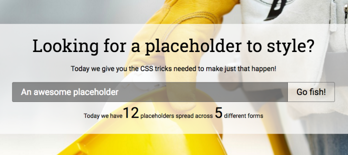
We’ve explored the deep dungeons of CSS before and found that we can access almost anything you see in your browser and shape it to your liking. But placeholder text in forms, that can’t possibly be styled, right? Right! … wrooong! Let me show you how to use CSS to make your placeholders look pretty again.
Styling input placeholders with CSS
HTML5 and placeholders
HTML5 gave us many wonderful things. And in this case, the grass was really greener on the other side. After paddling our small HTML boat over to the grand island of HTML5 we set up camp and decided to stay, for life (or until some other even cooler island - HTML6 anyone!? - floats by).
One of many wonderful things was that we could toss out all those onfocus and onblur JavaScript combos that toggled some informative text in forms before they were filled in. Sure we had labels, and even lines of help text, but sometimes a placeholder was just right for UX and overall design (and semantics).
Old school versus new school
Remember the horrors of old? Let’s take a trip down memory lane. This is how I used to “fake” placeholders with JavaScript (true story) in the age when dragons still roamed the lands and everyone travelled by horse (a few years ago ... trust me):
<input type="text" name="mahfieldyo"
  value="A brilliant placeholder"
  onfocus="if (this.value=='A brilliant placeholder') this.value='';"
  onblur="if (this.value=='') this.value='A brilliant placeholder';"
/>
<input type="text" name="mahfieldyo"
  placeholder="A brilliant placeholder indeed">
Your design task
So the story goes like this - you get a design, from a designer. And as we all know, they sometimes tend to design impossible things, things not meant for the web (damn you Photoshop). But things progress, and with time we suddenly have new super powers in CSS. Remember all those round corners about 6-7 years ago that were almost impossible before CSS3 (hello 3x3 cell tables with images in each corner)?

You need a black semi-transparent (50%) background with a white colored text (opaque). Easy. You try the CSS' color property on the input field. Doesn't work. The placeholder will default to gray (a washed out white color). But you want it to be clear white, just like when you type text in there. You give up and cry a little bit. Fear no more. The solution is not far away!
You’d think that this really is something that is impossible. The big browser vendors sat down and said “Our way or the highway, son”, and we be all like “Yes, ok Sir, sorry for bothering you”.
But no, this is not the case this time. There is no Hersey highway you need to take. Let me show you how magically easy you can change the style of a placeholder text. Let pseudo elements (and classes) lead the way to glory and fame. But also, let vendor specific implementations hurl shots at you along the way (rest assured, we will reach the other side alive).
The code
Our new friends to get acquainted with are: ::-webkit-input-placeholder, :-moz-placeholder, ::-moz-placeholder and :-ms-input-placeholder.
To mix things up for us, they interchange between using one colon (pseudo-class) and two colons (pseudo-element) in the beginning. Because … why not?
Chrome, Safari, Opera and even Edge will listen for the webkit vendor tag, older IE (10+) for the ms vendor tag, and Firefox for the moz vendor tag. Easy peasy. So with these “tools” our design will work everywhere *.
* Not really everywhere, but close enough for me to say “everywhere” without being called a complete liar. Who cares about IE9, Firefox 3, and other legacy browsers anyways? Oh, you do?! Then I feel sorry for you (but also laughing a little bit at the same time, like when people walk into a lamp post, or they slip on a banana peel).
Let’s look at them in action. This here is them magic lines to fix it all:
::-webkit-input-placeholder {
	color: white;
}
:-moz-placeholder {
	color: white;
	opacity: 1;
}
::-moz-placeholder {
	color: white;
	opacity: 1;
}
:-ms-input-placeholder {
	color: white;
}
Not bad. That's it. Just copy pasta and give it a taste!
There are some details to explain though. Keep reading.
Vendor specifics and pitfalls
Firefox has different implementations of this spread throughout their versions, hence the almost duplicate definitions with “:” and “::” (double-colon is the latest and greatest implementation).
A catch with this code is that you cannot refactor these into one joined group in CSS, because if one browser doesn’t understand all of the lines it will ignore all of the rules in it, even the lines it does understand. So you must go for all four of them as separate groups, like in my example. Hey, don’t shoot the messenger!
Also, Mozilla’s implementation lowers the opacity of the text, so you need to “reset” it manually to get it to look just right (with opacity: 1;). After that, you’re good to go.
And of course you can be more specific than that and only change placeholder design on specific fields by prepending these pseudo classes with the class name of your choice.
Want more?
Read this brilliant Stack Overflow answer for more details about vendor support and such.
Need more tricks to fuel that CSS fire of yours? Check out how you can override that ugly yellow default background on pre-filled input fields in Chrome.