Ever scrolled down a website and been amazed that objects doesn't behave like you expect them to? Instead of flowing static content upwards on the screen as we scroll we can now easily animate them in any way. Fly text sideways, zoom in images, fade out objects, and more!
Animate your webpage with the scrollbar
What is Skrollr
Skrollr is a JavaScript-plugin that helps you animate objects on your webpage as you scroll. A lot of people call it "Parallaxing", but that is just one of many effects you can add to your site. There are plenty of these kind of plugins out there, but from my light testing I found Skrollr to be the most lightweight and straight-to-the point of what I needed.
You just include Skrollr and then append data-attributes in your HTML, this will create animation keypoints at different scroll positions. Then tweak your animations with normal CSS-styles while Skrollr works the magic. It doesn’t even need jQuery, so it’s a very quick load.
However, I’ve found Skrollr - as well as many other plugins - totally missing a "Getting started guide". So you’re kind of left at looking up the source to get started, or digging through the source of some examples, and that is absolutely not for everyone. I thought this guide might help you get started with it, with some basic setup and examples. It really is very simple!
To see a demo of some of the possibilities we have with Skrollr, check this link:
http://prinzhorn.github.io/skrollr/
Download and "Install"
First things first. Let’s download Skrollr, which isn’t such an intuitive task that you might think. Mainly because there is no download. You have to go to the projects Github-page, and then find the correct minified JavaScript-file, then select all code and manually create this file on your own with that code.
The latest files on Github are also not the greatest as they're work in progress. So find version 0.5.14, which is the stable release this text was based upon. You can find a link to the correct version in the projects main readme-file.
Now open up the "Dist"-folder, and then open the first file in there - " skrollr.min.js ". There you go! Just place it with your HTML and CSS-files and include it the bottom of your page.
Starting up
Create the basic structure of this test case in a folder on your computer. Let’s call it "skrollr". Create a "index.html" in there, and a "style.css". You also need to place the minified Skrollr-code in there. You are of course free to name and place the files wherever you’d like, but my example code will use this structure.
Open your newly created html-file and paste this basic structure in. The only important parts are that you include Skrollr and a CSS-file. But let this serve as a quick start:
With this code you have all you need to start. We will place a few div-tags in here, and a init-script. And we will create some styles. But let’s get that init-script in place so Skrollr get’s loaded (adding the script-tag isn’t enough).
Just paste this small JavaScript init-snippet in the empty script-block near the end of your html-file.
// Start Skrollr
window.onload = function() {
    skrollr.init({
        forceHeight: false
    });
}
The line skrollr.init is the important one, surrounded by a simple onload-check so that we don’t start manipulating the DOM before it’s finalized. In this example we can see a setting being sent in with the init-setting, forceHeight, set to false. The default is true, so you could just remove the setting altogether if you’d like to change it. What forceHeight does is to make sure that if you try and animate something beyond the total height of your html body, Skrollr will force an increase on the height to allow you to enjoy the full animation. I just included this setting this time to show you how basic settings works, we don’t really need forceHeight for this example to work.
First basic demo
Almost done! Nah, not really. But let’s get going with things you already know - HTML and CSS. My idea for this example to get you up and running in a quick and easy enough way is to simple have three tall blocks stacked on top of each other that we’ll scroll by and see some kind of different animation on each of them.
With this markup (we will come back to the other examples/blocks later) we can move on to our CSS:
/* General */
body, html {
    height: 100%;
    padding: 0;
    margin: 0;
}
.block {
    height: 100%;
    box-sizing: border-box; /* One of my CSS3-favourites */
}

/* Specifics */
#block1 {
    background-color: black;
    color: white;
    padding: 20px;
}
    #block1 p {
        width: 200px;
        line-height: 200%;
        margin-top: 400px;
    }
We just give all the blocks some height, namely the height of your current viewport on the browser. We also force the body-tag to be at least one viewport tall. At last we give some simple style to the top block and it’s text, like color and spacing.
Now, if you take the html-page for a test spin, you should be able to see a big black block of fullscreen background, and some white text. Also make sure you get no weird errors.
But scrolling doesn’t do anything!? OMG! But don’t worry, you just need to write thousands of lines of JavaScript to move the p-tag ... Nah, just kidding. We just need two small attributes added to our html! I kid you not, check this out:
Save and retry, it should perform magic right before your eyes as you scroll downwards (and then reversing when you go back up again).
The data attributes are all that you need to add to trigger Skrollr. Skrollr will automagically animate any CSS you place between your start and stop positions.
data-start is the starting point of your entire page, the absolute top, your page’s y-axis = 0.
data-500-start is the end and triggers 500 pixels from the very top (start) of the page.
You could change this around to test and see how it works. Skrollr just animates your CSS from the closest to the top down to the furthest from the top - from padding-left:20px; to padding-left:400px; the more you scroll down the page.
Important to note is that you must specify some CSS in each data-attribute, Skrollr won’t read anything from your CSS-file.
Change this CSS around a bit to experiment with your animation. It’s really nice and easy. Almost no new syntax to learn and remember, isn’t that sweet?!
Onwards
Now you know the basics of how this works. Let’s do a couple of more examples which will introduce a few more Skrollr-goodies.
Next task is to animate multiple attributes, at the same time! And we will also stack two animations after another by adding more data-tags. Don’t sweat, this is also easy!
This time we will not manipulate anything on the main block, so create a new div inside of the "block2" div with these attributes:
That’s all! This will animate a 100x100 little red block up to 300x300, then slide it from the top of the containing block down 300 pixels - following the screen as it scrolls.
Let’s analyse this new code we’ve added:
data-top is new, but it behaves very similar to data-start with the difference that data-start fires at the absolute top of the document while data-top fires when the top of that specific block hits the top of the viewport.
data-600-top By specifying a number of pixels before the "top" setting we offset the start with that number of pixels. Here we start the animation 600 pixels before this object reaches the top of the current viewport.
You might have already figured this out, but data-600-top fires before data-300-top, which in turn fires before data-top. So it almost fires backwards to what you would expect, until you get used to this. Stringing many trigger-points together like this let’s you change the animation for the same object at many different scroll positions. You could add as many as you’d like, but try and not go totally nuts about it.
A more advanced example
Now let’s raise the bar even further for our final task. We’re gonna animate three different objects - at the same time, at different trigger points! One block will slide in from off-screen and then get larger, another will change color, and a third block of text will come sliding up from invisibility.
I’m just assuming that you can figure out all of these animation steps, at least good enough so that nothing in there is confusing. The "hsla"-color is explained a bit more in the CSS, and you can look it up on - http://www.css3.info/preview/hsla/ - if you’re unfamiliar with it. Skrollr makes it very easy to animate color changes when we use the hsl(a) or rgb(a) syntax. Skrollr cannot animate color as strings, like "red" to "blue", or hex-values like "#000" to "#f3f904", so you need to get your hsl/rgb-skills straight right away.
Let’s do a few additions to the CSS-file before testing this out:
#block3 {
    background-color: #bbb;
}
    #block3 div {
        float: left;
        height: 50px;
    }
    #block3 div:nth-child(1) {
        width: 100px;
        margin-left:-400px;
        background-color: hsla(255,70%,100%,0.9);
        /* HSLA: Hue, Saturation%, Light%, Alpha (Opacity) */
    }
    #block3 div:nth-child(2) {
        width: 200px;
        background-color: hsla(200,70%,100%,0.1);
        border: 5px solid black;
    }
    #block3 p {
        padding-top: 400px;
        opacity: 0;
        width: 200px;
        line-height: 200%;
    }
Nothing extra fancy here, except the use of the CSS-selector nth-child to select the first div and the second div without giving them unnecessary id tags in the markup. And as I said before, if you’re not familiar with the hsla-coloring in CSS3 you should check that up. Basically, this CSS just gives some color and shape to the two blocks and the text. You should test the effects out.
What’s next?
There’s a lot more to test and learn with Skrollr, but now that I have got you started I leave that task to you. data-end, data-center, data-bottom, and data--100-top (for when a object is 100 pixels with it’s top above the viewport) are some other cool triggers you can try out. Also easing of animations - "padding[swing]:10px;" - should be checked out as there are a few methods to choose from.
And of course you shouldn’t miss trying to make your own parallaxing background-demo. Just add three divs, position them absolute on top of each other, make them cover the screen, set a PNG-background with a lot of transparency on each, then make them reposition these backgrounds with background position at different speeds (higher start-stop trigger difference = higher speed) as you scroll.
Be aware of
All is not all good in the world of scrolling and animations though. I’ve discovered that animating large images - especially with animated text on top of it - gives a very choppy experience. And with scroll-triggered animations, you must always keep in mind that the user can scroll very fast, or very slow, which drastically changes the experience. So scroll-triggered animation isn’t perfect for everything.
Also, when the page has loaded and Skrollr has initiated, it will take the first trigger-point for each object and apply that CSS as inline style. If your stylesheet differs from this, you will get a loading experience where the objects on the page looks like they hop around as the Skrollr-style overrides your stylesheet.
Skrollr has a special plugin for mobile, running normal Skrollr on mobile doesn’t work very well. However, Responsive animation takes some extra effort to get working smooth since most triggers use pixels. You can bypass that by only triggering animations on data-top and dynamic values like percentage. You could also create trigger objects in the markup that with their unique id value and the data-anchor-target helps trigger animations.
Reading more
For the offical documentation you should check this link: https://github.com/Prinzhorn/skrollr/tree/0.5.14#documentation
Some examples
The main example-page by the plugin author:
http://prinzhorn.github.io/skrollr/
A collection of different examples:
https://github.com/Prinzhorn/skrollr/tree/master/examples#examples
Article teaching you to animate images, including drawing along a SVG path:
http://pepsized.com/merry-scrolling-with-skrollr-js/
A Nettuts+ article about beginning with Skrollr:
http://webdesign.tutsplus.com/tutorials/htmlcss-tutorials/jazz-up-a-static-webpage-with-subtle-parallax/
Some pages that use Skrollr
Subtle effects to spice up an article:
http://futuremylove.com/#home
Heavy use of image-swapping to create 3D-like effects:
http://www.officeline.se/kampanj/
http://moto.oakley.com/
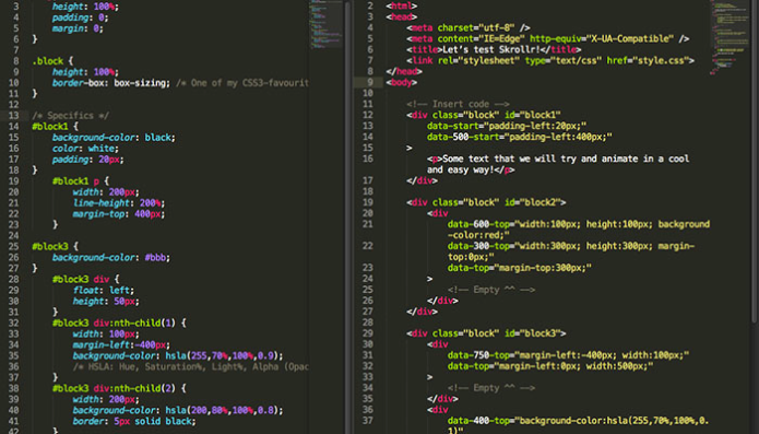
Entire source HTML
Entire source CSS
/* General */
body, html {
    height: 100%;
    padding: 0;
    margin: 0;
}

.block {
    height: 100%;
    box-sizing: border-box; /* One of my CSS3-favourites */
}

/* Specifics */
#block1 {
    background-color: black;
    color: white;
    padding: 20px;
}
    #block1 p {
        width: 200px;
        line-height: 200%;
        margin-top: 400px;
    }

#block3 {
    background-color: #bbb;
}
    #block3 div {
        float: left;
        height: 50px;
    }
    #block3 div:nth-child(1) {
        width: 100px;
        margin-left:-400px;
        background-color: hsla(255,70%,100%,0.9);
        /* HSLA: Hue, Saturation%, Light%, Alpha (Opacity) */
    }
    #block3 div:nth-child(2) {
        width: 200px;
        background-color: hsla(200,80%,100%,0.8);
        border: 5px solid black;
    }
    #block3 p {
        width: 200px;
        line-height: 200%;
    }
Entire source JavaScript
None needed - woop woop!